
[Animação] Giro Linear
[Animação] Giro Linear Para aplicar esse efeito de animação, basta colocar o código CSS (abaixo) de qualquer widget (recomendo usar uma imagem) Não precisa definir Classe CSS Código CSS Copiar Código selector { animation: giro 6s linear infinite; } @keyframes giro{ 0%{ transform: rotate(0deg); } 100%{ transform: rotate(360deg); } }
[Animação] Respiro
[Animação] Escala Para aplicar esse efeito de animação, basta colocar o código CSS (abaixo) de qualquer widget (recomendo usar uma imagem) Defina em Avançado/Classe CSS: respiro-scale Código CSS Copiar Código .respiro-scale { animation: respiroScale 5s ease-in-out infinite; } @keyframes respiroScale { 0%, 100% { transform: scale(1); } 50% { transform: scale(1.3); } } it-backdrop-filter: blur(15px); }
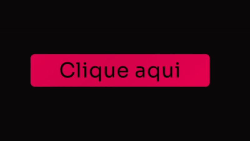
[Botão] Detalhe lateral
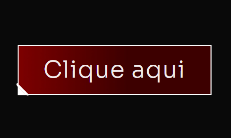
[Botão] Detalhe lateral Adicione um Widget de botão no Elementor Defina a Classe CSS: btn Cole esse código no botão (Avançado/Custom CSS) Código CSS Copiar Código .btn { /* Fundo do botão: Gradiente Vermelho Escuro/Preto (MANTIDO) */ background: linear-gradient(90deg, #8B0000 -12.74%, #3D0000 56.76%); border: 2px solid #FFFFFF; /* Borda BRANCA do botão */ position: relative; } /* Pseudo-elemento ::before cria a primeira linha diagonal do corte */ .btn::before { content: “”; width: 4px; height: 28px; background: #FFFFFF; /* Cor da linha (BRANCA) */ border: 2px solid #FFFFFF; /* Cor da borda da linha (BRANCA) */ /* Transformação e Posição */ -webkit-transform: rotate(-45deg); -ms-transform: rotate(-45deg); transform: rotate(-45deg); position: absolute; /* Esconde partes desnecessárias da borda */ border-top: 0; border-left: 0; border-bottom: 0; /* Posição no canto */ bottom: -7px; left: 4px; /* Arredondamento */ border-bottom-left-radius: 10px; border-top-left-radius: 10px; } /* Pseudo-elemento ::after cria o triângulo de preenchimento do corte */ .btn::after { content: “”; position: absolute; left: -2px; bottom: -2px; /* Cria o formato de triângulo */ border-top: 15px solid transparent; border-left: 15px solid #FFFFFF; /* Lado esquerdo (cor do corte BRANCA) */ }
[Botão] Rainbow Hover
[Botão] Rainbow Hover Adicione um Widget de botão no Elementor Defina a Classe CSS: btn Cole esse código no botão (Avançado/Custom CSS) Código CSS Copiar Código .btn .elementor-button { /* Cores e Formato */ background: #4D00E8; /* Cor roxa sólida principal */ color: #FFFFFF; /* Texto branco */ border: none; border-radius: 12px; /* Bordas suaves */ padding: 15px 30px; /* Efeito de Profundidade 3D */ box-shadow: 0 8px 15px rgba(0, 0, 0, 0.9), /* Sombra principal escura */ 0 0 20px #4D00E8 inset; /* Brilho interno roxo suave */ /* Transições */ transition: all 0.3s cubic-bezier(.25,.8,.25,1); /* Transição elegante para todos os estados */ /* Z-Index para garantir que o texto esteja acima */ z-index: 1; } /* Efeito de HOVER (Levanta o botão e intensifica a sombra) */ .btn:hover .elementor-button { background: #7B24F8; /* Roxo ligeiramente mais claro no hover */ /* Botão “levanta” */ transform: translateY(0px); /* Sombra mais intensa */ box-shadow: 0 12px 20px rgba(0, 0, 0, 0.5), 0 0 15px #4D00E8A0 inset; /* Brilho interno mais escuro */ } /* Efeito de CLICK (Botão Pressionado) */ .btn:active .elementor-button { /* Botão “afunda” */ transform: translateY(1px); background: #4D00E8; /* Volta para a cor original */ box-shadow: 0 4px 8px rgba(0, 0, 0, 0.3), /* Sombra menor */ 0 0 5px #7B24F880 inset; /* Brilho interno sutil */ } /* — EFEITO DE BORDA ANIMADA (OPCIONAL) — */ .btn .elementor-button-wrapper { position: relative; overflow: hidden; border-radius: 12px; } .btn .elementor-button::after { content: ”; position: absolute; top: 0; left: 0; width: 100%; height: 100%; border: 3px solid #FF00E8; /* Borda rosa para contraste */ border-radius: 12px; opacity: 0; transition: opacity 0.3s ease-in-out; } .btn:hover .elementor-button::after { opacity: 1; animation: pulse 1.5s infinite; } @keyframes pulse { 0% { box-shadow: 0 0 0 0 #FF00E840; /* Sombra inicial transparente */ } 70% { box-shadow: 0 0 0 15px #FF00E800; /* Sombra se expande e some */ } 100% { box-shadow: 0 0 0 0 #FF00E800; } }
[Botão] Neon
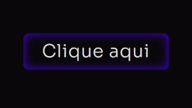
[Botão] Neon Adicione um Widget de botão no Elementor Defina a Classe CSS: btn Cole esse código no botão (Avançado/Custom CSS) Código CSS Copiar Código .btn .elementor-button { /* Cores e Formato */ background: #4D00E8; /* Cor roxa sólida principal */ color: #FFFFFF; /* Texto branco */ border: none; border-radius: 12px; /* Bordas suaves */ padding: 15px 30px; /* Efeito de Profundidade 3D */ box-shadow: 0 8px 15px rgba(0, 0, 0, 0.9), /* Sombra principal escura */ 0 0 20px #4D00E8 inset; /* Brilho interno roxo suave */ /* Transições */ transition: all 0.3s cubic-bezier(.25,.8,.25,1); /* Transição elegante para todos os estados */ /* Z-Index para garantir que o texto esteja acima */ z-index: 1; } /* Efeito de HOVER (Levanta o botão e intensifica a sombra) */ .btn:hover .elementor-button { background: #7B24F8; /* Roxo ligeiramente mais claro no hover */ /* Botão “levanta” */ transform: translateY(0px); /* Sombra mais intensa */ box-shadow: 0 12px 20px rgba(0, 0, 0, 0.5), 0 0 15px #4D00E8A0 inset; /* Brilho interno mais escuro */ } /* Efeito de CLICK (Botão Pressionado) */ .btn:active .elementor-button { /* Botão “afunda” */ transform: translateY(1px); background: #4D00E8; /* Volta para a cor original */ box-shadow: 0 4px 8px rgba(0, 0, 0, 0.3), /* Sombra menor */ 0 0 5px #7B24F880 inset; /* Brilho interno sutil */ } /* — EFEITO DE BORDA ANIMADA (OPCIONAL) — */ .btn .elementor-button-wrapper { position: relative; overflow: hidden; border-radius: 12px; } .btn .elementor-button::after { content: ”; position: absolute; top: 0; left: 0; width: 100%; height: 100%; border: 3px solid #FF00E8; /* Borda rosa para contraste */ border-radius: 12px; opacity: 0; transition: opacity 0.3s ease-in-out; } .btn:hover .elementor-button::after { opacity: 1; animation: pulse 1.5s infinite; } @keyframes pulse { 0% { box-shadow: 0 0 0 0 #FF00E840; /* Sombra inicial transparente */ } 70% { box-shadow: 0 0 0 15px #FF00E800; /* Sombra se expande e some */ } 100% { box-shadow: 0 0 0 0 #FF00E800; } }
[Botão] Pulse V2
[Botão] Pulse V2 Adicione um Widget de botão no Elementor Não precisa definir Classe CSS. Cole esse código no botão (Avançado/Custom CSS) Código CSS Copiar Código .elementor-button { /* Define o gradiente animado de branco/cinza claro */ background: linear-gradient(-45deg, #FFFFFF, #BABABA, #FFFFFF, #BABABA, #FFFFFF, #BABABA); background-size: 800% 400%; /* Tamanho maior para o efeito de movimento */ border-radius: 50px; /* Bordas arredondadas (estilo pílula) */ transition: all 0.6s ease; /* Transição para o hover */ /* Combinação de animações: fundo deslizante e efeito ‘pisca’ */ animation: fundo-desliza 10s infinite cubic-bezier(.62, .28, .23, .99) both, anel-pisca 1.8s infinite; box-shadow: 0 0 25px -8px #FFFFFF80; /* Sombra sutil branca no estado normal */ } /* Efeito de aumento no hover */ .elementor-button:hover{ transform: scale(1.08); } /* Pseudo-elemento para o efeito de anel/brilho */ .elementor-button::before{ content: “”; background: transparent; width: 100%; height: 100%; position: absolute; top: 0; left: 0; border-radius: inherit; animation: anel-pisca 1.8s infinite; /* Aplica o efeito de anel */ /* Sombra do anel branca */ box-shadow: 0 0 25px -8px #FFFFFFB0; } /* Define a animação do anel que se expande e some */ @keyframes anel-pisca { 70% { box-shadow: 0 0 0 40px transparent; /* Anel se expande */ } 100% { box-shadow: 0 0 0 0 transparent; /* Anel desaparece */ } } /* Define a animação do gradiente que desliza */ @keyframes fundo-desliza { 0%, 100% { background-position: 0% 50%; /* Posição inicial/final */ } 50% { background-position: 100% 50%; /* Movimento do fundo */ } }
[Botão] Abrindo Ícone
[Botão] Abrindo Ícone Adicione um Widget de botão no Elementor Defina a classe: btn Defina um ícone dentro do botão Cole esse código no botão (Avançado/Custom CSS) Código CSS Copiar Código @keyframes fadeUp { 0% { opacity: 0; filter: blur(7px); transform: translateY(80px); } 100% { opacity: 1; filter: blur(0); transform: translateY(0); } } selector { opacity: 0; /* Começa invisível */ animation: fadeUp 0.7s 0.4s ease forwards; /* Aplica a animação de subir */ } /* Estilo do botão principal */ .btn .elementor-button{ /* Classe .btn */ /* Gradiente de fundo: roxo e seus tons */ background: linear-gradient(90deg, #4D00E8, #7B24F8); border-radius: 10px; border: solid 2px #4D00E850; /* Borda roxa suave */ transition: 0.7s 0.2s ease all; box-shadow: 0px 0px 0px 0px #7B24F890; /* Sombra inicial transparente */ } .btn:hover .elementor-button{ box-shadow: 0px 0px 70px -10px #7B24F890; /* Efeito de brilho roxo no hover */ } /* Pseudo-elemento para a animação de textura/brilho */ .btn .elementor-button::before{ content: “”; width: 100%; height: 100%; position: absolute; top: 0; left: 0; z-index: 99; animation: 3.4s cubic-bezier(.2,.5,.9,.6) 2s infinite textura; /* Animação de textura */ /* Gradiente animado: roxo e seus tons */ background: linear-gradient(90deg, #4D00E8, #7B24F8, #4D00E8, #7B24F8, #4D00E8, #7B24F8); border-radius: inherit; border: inherit; background-size: 400% 200%; transition: all .8s 0.5s; } .btn:hover .elementor-button::before{ opacity: 0; /* Desaparece no hover */ } .btn .elementor-button-text{ z-index: 222; /* Texto acima de tudo */ } /* Animação do fundo de textura/gradiente */ @keyframes textura { 0% { background-position: 0 0 } 100% { background-position: 100% 0 } } /* — RESPONSIVIDADE PARA ÍCONE (Mobile: max-width: 600px) — */ @media only screen and (max-width: 600px) { .btn .elementor-button-icon{ position: absolute; top: 50%; transform: translatey(-50%); right: 0px; background: linear-gradient(90deg, #4D00E8, #7B24F8); /* Gradiente Roxo */ border-radius: 10px; padding: 20px; border: solid 2px #4D00E850; /* Borda roxa suave */ transition: 0.7s ease all; filter: blur(3px); rotate: 8deg; opacity: 0; } .btn:hover .elementor-button-icon{ position: absolute; top: 50%; transform: translatey(-50%); right: -65px; background: linear-gradient(90deg, #4D00E8, #7B24F8); /* Gradiente Roxo */ border-radius: 10px; padding: 20px; border: solid 2px #4D00E850; /* Borda roxa suave */ filter: blur(0px); rotate: 0deg; opacity: 1; box-shadow: 0px 0px 70px -10px #7B24F890; /* Efeito de brilho roxo */ } } /* — RESPONSIVIDADE PARA ÍCONE (Desktop: min-width: 600px) — */ @media only screen and (min-width: 600px) { .btn .elementor-button-icon{ position: absolute; top: 50%; transform: translatey(-50%); right: 0px; background: linear-gradient(90deg, #4D00E8, #7B24F8); /* Gradiente Roxo */ border-radius: 10px; padding: 25px; border: solid 2px #4D00E850; /* Borda roxa suave */ transition: 0.7s ease all; filter: blur(3px); rotate: 8deg; opacity: 0; } .btn:hover .elementor-button-icon{ position: absolute; top: 50%; transform: translatey(-50%); right: -77px; background: linear-gradient(90deg, #4D00E8, #7B24F8); /* Gradiente Roxo */ border-radius: 10px; padding: 25px; border: solid 2px #4D00E850; /* Borda roxa suave */ filter: blur(0px); rotate: 0deg; opacity: 1; box-shadow: 0px 0px 70px -10px #7B24F890; /* Efeito de brilho roxo */ } }
[Botão] Arsenal Pages
[Botão] Arsenal Pages Adicione um Widget de botão no Elementor Defina a classe: btn-style Cole esse código no botão (Avançado/Custom CSS) Código CSS Copiar Código :root { –shiny-cta-bg: #000000 !important; /* fundo do botão */ –shiny-cta-bg-subtle: #0f2e22 !important; /* borda escura */ –shiny-cta-fg: #ffffff !important; /* texto */ –shiny-cta-highlight: #00FF73 !important; /* luz principal */ –shiny-cta-highlight-subtle: #84FFBC !important; /* luz suave */ } @property –gradient-angle { syntax: ““; initial-value: 0deg; inherits: false; } @property –gradient-angle-offset { syntax: ““; initial-value: 0deg; inherits: false; } @property –gradient-percent { syntax: ““; initial-value: 5%; inherits: false; } @property –gradient-shine { syntax: ““; initial-value: white; inherits: false; } /* ———- BTN CLASS (adicione “btn-style” ao widget/botão) ———- */ @media only screen and (max-width: 600px) { .btn-style.elementor-button, .btn-style .elementor-button { –animation: gradient-angle linear infinite !important; –duration: 3s !important; /* tempo do giro do brilho */ –shadow-size: 2px !important; isolation: isolate !important; position: relative !important; overflow: hidden !important; cursor: pointer !important; outline-offset: 4px !important; padding: 1.25rem 1.5rem !important; line-height: 1.2 !important; border: 1px solid transparent !important; border-radius: 360px !important; color: var(–shiny-cta-fg) !important; background: linear-gradient(var(–shiny-cta-bg), var(–shiny-cta-bg)) padding-box, conic-gradient( from calc(var(–gradient-angle) – var(–gradient-angle-offset)), transparent, var(–shiny-cta-highlight) var(–gradient-percent), var(–gradient-shine) calc(var(–gradient-percent) * 2), var(–shiny-cta-highlight) calc(var(–gradient-percent) * 3), transparent calc(var(–gradient-percent) * 4) ) border-box !important; box-shadow: inset 0 0 0 1px var(–shiny-cta-bg-subtle) !important; transition: 800ms cubic-bezier(0.25, 1, 0.5, 1) !important; transition-property: –gradient-angle-offset, –gradient-percent, –gradient-shine !important; } } @media only screen and (min-width: 600px) { .btn-style.elementor-button, .btn-style .elementor-button { –animation: gradient-angle linear infinite !important; –duration: 3s !important; –shadow-size: 2px !important; isolation: isolate !important; position: relative !important; overflow: hidden !important; cursor: pointer !important; outline-offset: 4px !important; padding: 1.5rem 2.5rem !important; line-height: 1.2 !important; border: 1px solid transparent !important; border-radius: 360px !important; color: var(–shiny-cta-fg) !important; background: linear-gradient(var(–shiny-cta-bg), var(–shiny-cta-bg)) padding-box, conic-gradient( from calc(var(–gradient-angle) – var(–gradient-angle-offset)), transparent, var(–shiny-cta-highlight) var(–gradient-percent), var(–gradient-shine) calc(var(–gradient-percent) * 2), var(–shiny-cta-highlight) calc(var(–gradient-percent) * 3), transparent calc(var(–gradient-percent) * 4) ) border-box !important; box-shadow: inset 0 0 0 1px var(–shiny-cta-bg-subtle) !important; transition: 800ms cubic-bezier(0.25, 1, 0.5, 1) !important; transition-property: –gradient-angle-offset, –gradient-percent, –gradient-shine !important; } } .btn-style.elementor-button::before, .btn-style.elementor-button::after, .btn-style.elementor-button span::before, .btn-style .elementor-button::before, .btn-style .elementor-button::after, .btn-style .elementor-button span::before { content: “” !important; pointer-events: none !important; position: absolute !important; inset-inline-start: 50% !important; inset-block-start: 50% !important; translate: -50% -50% !important; z-index: -1 !important; } .btn-style.elementor-button::before, .btn-style .elementor-button::before { –size: calc(100% – var(–shadow-size) * 3) !important; –position: 2px !important; –space: calc(var(–position) * 2) !important; width: var(–size) !important; height: var(–size) !important; background: radial-gradient( circle at var(–position) var(–position), white calc(var(–position) / 4), transparent 0 ) padding-box !important; background-size: var(–space) var(–space) !important; background-repeat: space !important; mask-image: conic-gradient( from calc(var(–gradient-angle) + 45deg), black, transparent 10% 90%, black ) !important; border-radius: inherit !important; opacity: 0.4 !important; } .btn-style.elementor-button::after, .btn-style .elementor-button::after { –animation: shimmer linear infinite !important; width: 100% !important; aspect-ratio: 1 !important; background: linear-gradient( -50deg, transparent, var(–shiny-cta-highlight), transparent ) !important; mask-image: radial-gradient(circle at bottom, transparent 40%, black) !important; opacity: 0.6 !important; } .btn-style.elementor-button span, .btn-style .elementor-button span { z-index: 1 !important; position: relative !important; } .btn-style.elementor-button span::before, .btn-style .elementor-button span::before { size: calc(100% + 1rem) !important; width: 1200px !important; /* área do brilho interno */ height: 100px !important; box-shadow: inset 0 -1ex 2rem 4px var(–shiny-cta-highlight) !important; opacity: 0 !important; transition: opacity 1500ms cubic-bezier(0.25, 1, 0.5, 1) !important; } .btn-style.elementor-button:hover, .btn-style.elementor-button:focus-visible, .btn-style .elementor-button:hover, .btn-style .elementor-button:focus-visible { –gradient-percent: 20% !important; –gradient-angle-offset: 95deg !important; –gradient-shine: var(–shiny-cta-highlight-subtle) !important; } .btn-style.elementor-button:hover span::before, .btn-style .elementor-button:hover span::before { opacity: 1 !important; } @keyframes gradient-angle { to { –gradient-angle: 360deg; } } @keyframes shimmer { to { transform: rotate(360deg) !important; } } @keyframes breathe { 50% { transform: scale(1.2) !important; } } .btn-style.elementor-button, .btn-style.elementor-button::before, .btn-style.elementor-button::after, .btn-style .elementor-button, .btn-style .elementor-button::before, .btn-style .elementor-button::after { animation: var(–animation) var(–duration), var(–animation) calc(var(–duration) / 0.4) reverse paused !important; animation-composition: add !important; } .btn-style.elementor-button:hover, .btn-style.elementor-button:hover::before, .btn-style.elementor-button:hover::after, .btn-style .elementor-button:hover, .btn-style .elementor-button:hover::before, .btn-style .elementor-button:hover::after { animation-play-state: running !important; } /* Ícone e texto dentro do botão (compatível com Elementor) */ .btn-style .elementor-button-icon, .btn-style.elementor-button .elementor-button-icon { font-size: 10px !important; color: inherit !important; } .btn-style .elementor-button-text, .btn-style.elementor-button .elementor-button-text { margin: auto !important; } /* HOVER: ícone gira dentro do botão com a classe .btn-style */ .btn-style.elementor-button .elementor-button-icon, .btn-style .elementor-button .elementor-button-icon { transition: transform .5s ease !important; transform-origin: 50% 50% !important; display: inline-flex !important; align-items: center !important; }
[Botão] Brilho + Preenchimento
[Botão] Brilho + Preenchimento Adicione um Widget de botão no Elementor Defina a classe: btn Cole esse código no botão (Avançado/Custom CSS) Código CSS Copiar Código .btn{ /* Classe principal */ overflow: hidden !important; /* Esconde elementos que transbordam */ border-radius: 10px; /* Cantos arredondados */ } .btn .elementor-button{ /* Gradiente de fundo animado: tons de rosa vibrante */ background: linear-gradient(-45deg, #FF0255, #D4004B, #FF0255, #D4004B, #FF0255, #D4004B); background-size: 800% 400%; /* Tamanho do fundo para animação */ transition: all .5s; animation: gradient 5s infinite cubic-bezier(.62, .28, .23, .99) both; /* Animação suave */ } @keyframes gradient { 0%, 100% { background-position: 0% 50%; /* Posição inicial do gradiente */ } 50% { background-position: 100% 50%; /* Posição final do gradiente */ } } .btn .elementor-button-text{ align-self: center; padding-right: 0px; z-index: 9; /* Acima dos pseudo-elementos */ transition: 1s ease; } .btn:hover .elementor-button-text{ color: #090909; /* Cor do texto no hover (preto escuro) */ transition: 1s ease; } .btn .elementor-button::before{ content: “”; background: #FFFFFF; /* Cor de preenchimento no hover AGORA BRANCA */ width: 100%; height: 100%; position: absolute; top: 0; left: 0; border-radius: 10px; transform: scalex(0); /* Começa invisível */ transform-origin: left; transition: 0.5s ease; } .btn:hover .elementor-button::before{ transform: scalex(1); /* Preenche no hover */ transform-origin: left; transition: 1s ease; } .btn .elementor-button::after { content: ”; /* Gradiente de brilho (slide 100% branco) */ background: linear-gradient(10deg, #FFFFFF 100%, #FFFFFF 100%); mix-blend-mode: overlay; /* Mistura o brilho com o fundo */ width: 90px; height: 160%; position: absolute; transform: translateX(-50%) skew(-25deg); bottom: 0%; user-select: none; pointer-events: none; animation: shinery 6s infinite ease-in-out; /* Animação de brilho deslizante */ } @keyframes shinery{ 0%, 100% { left: -10%; opacity: 0; } 20% { opacity: 1; } 48% { left: 140%; opacity: 1; } 51% { opacity: 0; } }
[Filtro] Bits
[Filtro] Bits Para aplicar esse efeito, basta colocar o código CSS (abaixo) em qualquer Widget da página (Recomendo colocar diretamente nas configurações da página) Código CSS Copiar Código body::after { content: “”; position: fixed; inset: 0; pointer-events: none; background-image: radial-gradient(circle, rgba(255,255,255,0.04) 1px, transparent 1px); background-size: 4px 4px; /* ajusta espaçamento dos pontos */ mix-blend-mode: screen; /* deixa os pontos “brancos” em cima */ z-index: 9999; }