
[Botão] Detalhe lateral
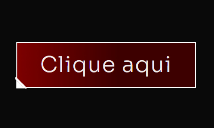
[Botão] Detalhe lateral Adicione um Widget de botão no Elementor Defina a Classe CSS: btn Cole esse código no botão (Avançado/Custom CSS) Código CSS Copiar Código .btn { /* Fundo do botão: Gradiente Vermelho Escuro/Preto (MANTIDO) */ background: linear-gradient(90deg, #8B0000 -12.74%, #3D0000 56.76%); border: 2px solid #FFFFFF; /* Borda BRANCA do botão */ position: relative; } /* Pseudo-elemento ::before cria a primeira linha diagonal do corte */ .btn::before { content: “”; width: 4px; height: 28px; background: #FFFFFF; /* Cor da linha (BRANCA) */ border: 2px solid #FFFFFF; /* Cor da borda da linha (BRANCA) */ /* Transformação e Posição */ -webkit-transform: rotate(-45deg); -ms-transform: rotate(-45deg); transform: rotate(-45deg); position: absolute; /* Esconde partes desnecessárias da borda */ border-top: 0; border-left: 0; border-bottom: 0; /* Posição no canto */ bottom: -7px; left: 4px; /* Arredondamento */ border-bottom-left-radius: 10px; border-top-left-radius: 10px; } /* Pseudo-elemento ::after cria o triângulo de preenchimento do corte */ .btn::after { content: “”; position: absolute; left: -2px; bottom: -2px; /* Cria o formato de triângulo */ border-top: 15px solid transparent; border-left: 15px solid #FFFFFF; /* Lado esquerdo (cor do corte BRANCA) */ }
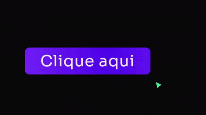
[Botão] Rainbow Hover
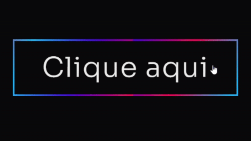
[Botão] Rainbow Hover Adicione um Widget de botão no Elementor Defina a Classe CSS: btn Cole esse código no botão (Avançado/Custom CSS) Código CSS Copiar Código .btn .elementor-button { /* Cores e Formato */ background: #4D00E8; /* Cor roxa sólida principal */ color: #FFFFFF; /* Texto branco */ border: none; border-radius: 12px; /* Bordas suaves */ padding: 15px 30px; /* Efeito de Profundidade 3D */ box-shadow: 0 8px 15px rgba(0, 0, 0, 0.9), /* Sombra principal escura */ 0 0 20px #4D00E8 inset; /* Brilho interno roxo suave */ /* Transições */ transition: all 0.3s cubic-bezier(.25,.8,.25,1); /* Transição elegante para todos os estados */ /* Z-Index para garantir que o texto esteja acima */ z-index: 1; } /* Efeito de HOVER (Levanta o botão e intensifica a sombra) */ .btn:hover .elementor-button { background: #7B24F8; /* Roxo ligeiramente mais claro no hover */ /* Botão “levanta” */ transform: translateY(0px); /* Sombra mais intensa */ box-shadow: 0 12px 20px rgba(0, 0, 0, 0.5), 0 0 15px #4D00E8A0 inset; /* Brilho interno mais escuro */ } /* Efeito de CLICK (Botão Pressionado) */ .btn:active .elementor-button { /* Botão “afunda” */ transform: translateY(1px); background: #4D00E8; /* Volta para a cor original */ box-shadow: 0 4px 8px rgba(0, 0, 0, 0.3), /* Sombra menor */ 0 0 5px #7B24F880 inset; /* Brilho interno sutil */ } /* — EFEITO DE BORDA ANIMADA (OPCIONAL) — */ .btn .elementor-button-wrapper { position: relative; overflow: hidden; border-radius: 12px; } .btn .elementor-button::after { content: ”; position: absolute; top: 0; left: 0; width: 100%; height: 100%; border: 3px solid #FF00E8; /* Borda rosa para contraste */ border-radius: 12px; opacity: 0; transition: opacity 0.3s ease-in-out; } .btn:hover .elementor-button::after { opacity: 1; animation: pulse 1.5s infinite; } @keyframes pulse { 0% { box-shadow: 0 0 0 0 #FF00E840; /* Sombra inicial transparente */ } 70% { box-shadow: 0 0 0 15px #FF00E800; /* Sombra se expande e some */ } 100% { box-shadow: 0 0 0 0 #FF00E800; } }
[Botão] Neon
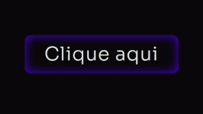
[Botão] Neon Adicione um Widget de botão no Elementor Defina a Classe CSS: btn Cole esse código no botão (Avançado/Custom CSS) Código CSS Copiar Código .btn .elementor-button { /* Cores e Formato */ background: #4D00E8; /* Cor roxa sólida principal */ color: #FFFFFF; /* Texto branco */ border: none; border-radius: 12px; /* Bordas suaves */ padding: 15px 30px; /* Efeito de Profundidade 3D */ box-shadow: 0 8px 15px rgba(0, 0, 0, 0.9), /* Sombra principal escura */ 0 0 20px #4D00E8 inset; /* Brilho interno roxo suave */ /* Transições */ transition: all 0.3s cubic-bezier(.25,.8,.25,1); /* Transição elegante para todos os estados */ /* Z-Index para garantir que o texto esteja acima */ z-index: 1; } /* Efeito de HOVER (Levanta o botão e intensifica a sombra) */ .btn:hover .elementor-button { background: #7B24F8; /* Roxo ligeiramente mais claro no hover */ /* Botão “levanta” */ transform: translateY(0px); /* Sombra mais intensa */ box-shadow: 0 12px 20px rgba(0, 0, 0, 0.5), 0 0 15px #4D00E8A0 inset; /* Brilho interno mais escuro */ } /* Efeito de CLICK (Botão Pressionado) */ .btn:active .elementor-button { /* Botão “afunda” */ transform: translateY(1px); background: #4D00E8; /* Volta para a cor original */ box-shadow: 0 4px 8px rgba(0, 0, 0, 0.3), /* Sombra menor */ 0 0 5px #7B24F880 inset; /* Brilho interno sutil */ } /* — EFEITO DE BORDA ANIMADA (OPCIONAL) — */ .btn .elementor-button-wrapper { position: relative; overflow: hidden; border-radius: 12px; } .btn .elementor-button::after { content: ”; position: absolute; top: 0; left: 0; width: 100%; height: 100%; border: 3px solid #FF00E8; /* Borda rosa para contraste */ border-radius: 12px; opacity: 0; transition: opacity 0.3s ease-in-out; } .btn:hover .elementor-button::after { opacity: 1; animation: pulse 1.5s infinite; } @keyframes pulse { 0% { box-shadow: 0 0 0 0 #FF00E840; /* Sombra inicial transparente */ } 70% { box-shadow: 0 0 0 15px #FF00E800; /* Sombra se expande e some */ } 100% { box-shadow: 0 0 0 0 #FF00E800; } }
[Botão] Pulse V2
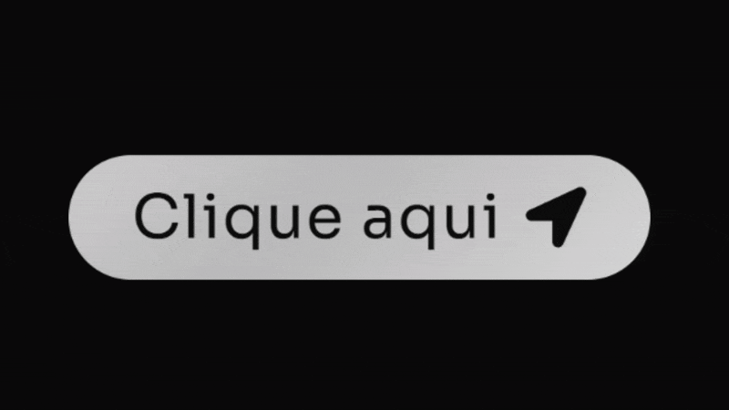
[Botão] Pulse V2 Adicione um Widget de botão no Elementor Não precisa definir Classe CSS. Cole esse código no botão (Avançado/Custom CSS) Código CSS Copiar Código .elementor-button { /* Define o gradiente animado de branco/cinza claro */ background: linear-gradient(-45deg, #FFFFFF, #BABABA, #FFFFFF, #BABABA, #FFFFFF, #BABABA); background-size: 800% 400%; /* Tamanho maior para o efeito de movimento */ border-radius: 50px; /* Bordas arredondadas (estilo pílula) */ transition: all 0.6s ease; /* Transição para o hover */ /* Combinação de animações: fundo deslizante e efeito ‘pisca’ */ animation: fundo-desliza 10s infinite cubic-bezier(.62, .28, .23, .99) both, anel-pisca 1.8s infinite; box-shadow: 0 0 25px -8px #FFFFFF80; /* Sombra sutil branca no estado normal */ } /* Efeito de aumento no hover */ .elementor-button:hover{ transform: scale(1.08); } /* Pseudo-elemento para o efeito de anel/brilho */ .elementor-button::before{ content: “”; background: transparent; width: 100%; height: 100%; position: absolute; top: 0; left: 0; border-radius: inherit; animation: anel-pisca 1.8s infinite; /* Aplica o efeito de anel */ /* Sombra do anel branca */ box-shadow: 0 0 25px -8px #FFFFFFB0; } /* Define a animação do anel que se expande e some */ @keyframes anel-pisca { 70% { box-shadow: 0 0 0 40px transparent; /* Anel se expande */ } 100% { box-shadow: 0 0 0 0 transparent; /* Anel desaparece */ } } /* Define a animação do gradiente que desliza */ @keyframes fundo-desliza { 0%, 100% { background-position: 0% 50%; /* Posição inicial/final */ } 50% { background-position: 100% 50%; /* Movimento do fundo */ } }
[Botão] Abrindo Ícone
[Botão] Abrindo Ícone Adicione um Widget de botão no Elementor Defina a classe: btn Defina um ícone dentro do botão Cole esse código no botão (Avançado/Custom CSS) Código CSS Copiar Código @keyframes fadeUp { 0% { opacity: 0; filter: blur(7px); transform: translateY(80px); } 100% { opacity: 1; filter: blur(0); transform: translateY(0); } } selector { opacity: 0; /* Começa invisível */ animation: fadeUp 0.7s 0.4s ease forwards; /* Aplica a animação de subir */ } /* Estilo do botão principal */ .btn .elementor-button{ /* Classe .btn */ /* Gradiente de fundo: roxo e seus tons */ background: linear-gradient(90deg, #4D00E8, #7B24F8); border-radius: 10px; border: solid 2px #4D00E850; /* Borda roxa suave */ transition: 0.7s 0.2s ease all; box-shadow: 0px 0px 0px 0px #7B24F890; /* Sombra inicial transparente */ } .btn:hover .elementor-button{ box-shadow: 0px 0px 70px -10px #7B24F890; /* Efeito de brilho roxo no hover */ } /* Pseudo-elemento para a animação de textura/brilho */ .btn .elementor-button::before{ content: “”; width: 100%; height: 100%; position: absolute; top: 0; left: 0; z-index: 99; animation: 3.4s cubic-bezier(.2,.5,.9,.6) 2s infinite textura; /* Animação de textura */ /* Gradiente animado: roxo e seus tons */ background: linear-gradient(90deg, #4D00E8, #7B24F8, #4D00E8, #7B24F8, #4D00E8, #7B24F8); border-radius: inherit; border: inherit; background-size: 400% 200%; transition: all .8s 0.5s; } .btn:hover .elementor-button::before{ opacity: 0; /* Desaparece no hover */ } .btn .elementor-button-text{ z-index: 222; /* Texto acima de tudo */ } /* Animação do fundo de textura/gradiente */ @keyframes textura { 0% { background-position: 0 0 } 100% { background-position: 100% 0 } } /* — RESPONSIVIDADE PARA ÍCONE (Mobile: max-width: 600px) — */ @media only screen and (max-width: 600px) { .btn .elementor-button-icon{ position: absolute; top: 50%; transform: translatey(-50%); right: 0px; background: linear-gradient(90deg, #4D00E8, #7B24F8); /* Gradiente Roxo */ border-radius: 10px; padding: 20px; border: solid 2px #4D00E850; /* Borda roxa suave */ transition: 0.7s ease all; filter: blur(3px); rotate: 8deg; opacity: 0; } .btn:hover .elementor-button-icon{ position: absolute; top: 50%; transform: translatey(-50%); right: -65px; background: linear-gradient(90deg, #4D00E8, #7B24F8); /* Gradiente Roxo */ border-radius: 10px; padding: 20px; border: solid 2px #4D00E850; /* Borda roxa suave */ filter: blur(0px); rotate: 0deg; opacity: 1; box-shadow: 0px 0px 70px -10px #7B24F890; /* Efeito de brilho roxo */ } } /* — RESPONSIVIDADE PARA ÍCONE (Desktop: min-width: 600px) — */ @media only screen and (min-width: 600px) { .btn .elementor-button-icon{ position: absolute; top: 50%; transform: translatey(-50%); right: 0px; background: linear-gradient(90deg, #4D00E8, #7B24F8); /* Gradiente Roxo */ border-radius: 10px; padding: 25px; border: solid 2px #4D00E850; /* Borda roxa suave */ transition: 0.7s ease all; filter: blur(3px); rotate: 8deg; opacity: 0; } .btn:hover .elementor-button-icon{ position: absolute; top: 50%; transform: translatey(-50%); right: -77px; background: linear-gradient(90deg, #4D00E8, #7B24F8); /* Gradiente Roxo */ border-radius: 10px; padding: 25px; border: solid 2px #4D00E850; /* Borda roxa suave */ filter: blur(0px); rotate: 0deg; opacity: 1; box-shadow: 0px 0px 70px -10px #7B24F890; /* Efeito de brilho roxo */ } }
[Botão] Arsenal Pages
[Botão] Arsenal Pages Adicione um Widget de botão no Elementor Defina a classe: btn-style Cole esse código no botão (Avançado/Custom CSS) Código CSS Copiar Código :root { –shiny-cta-bg: #000000 !important; /* fundo do botão */ –shiny-cta-bg-subtle: #0f2e22 !important; /* borda escura */ –shiny-cta-fg: #ffffff !important; /* texto */ –shiny-cta-highlight: #00FF73 !important; /* luz principal */ –shiny-cta-highlight-subtle: #84FFBC !important; /* luz suave */ } @property –gradient-angle { syntax: ““; initial-value: 0deg; inherits: false; } @property –gradient-angle-offset { syntax: ““; initial-value: 0deg; inherits: false; } @property –gradient-percent { syntax: ““; initial-value: 5%; inherits: false; } @property –gradient-shine { syntax: ““; initial-value: white; inherits: false; } /* ———- BTN CLASS (adicione “btn-style” ao widget/botão) ———- */ @media only screen and (max-width: 600px) { .btn-style.elementor-button, .btn-style .elementor-button { –animation: gradient-angle linear infinite !important; –duration: 3s !important; /* tempo do giro do brilho */ –shadow-size: 2px !important; isolation: isolate !important; position: relative !important; overflow: hidden !important; cursor: pointer !important; outline-offset: 4px !important; padding: 1.25rem 1.5rem !important; line-height: 1.2 !important; border: 1px solid transparent !important; border-radius: 360px !important; color: var(–shiny-cta-fg) !important; background: linear-gradient(var(–shiny-cta-bg), var(–shiny-cta-bg)) padding-box, conic-gradient( from calc(var(–gradient-angle) – var(–gradient-angle-offset)), transparent, var(–shiny-cta-highlight) var(–gradient-percent), var(–gradient-shine) calc(var(–gradient-percent) * 2), var(–shiny-cta-highlight) calc(var(–gradient-percent) * 3), transparent calc(var(–gradient-percent) * 4) ) border-box !important; box-shadow: inset 0 0 0 1px var(–shiny-cta-bg-subtle) !important; transition: 800ms cubic-bezier(0.25, 1, 0.5, 1) !important; transition-property: –gradient-angle-offset, –gradient-percent, –gradient-shine !important; } } @media only screen and (min-width: 600px) { .btn-style.elementor-button, .btn-style .elementor-button { –animation: gradient-angle linear infinite !important; –duration: 3s !important; –shadow-size: 2px !important; isolation: isolate !important; position: relative !important; overflow: hidden !important; cursor: pointer !important; outline-offset: 4px !important; padding: 1.5rem 2.5rem !important; line-height: 1.2 !important; border: 1px solid transparent !important; border-radius: 360px !important; color: var(–shiny-cta-fg) !important; background: linear-gradient(var(–shiny-cta-bg), var(–shiny-cta-bg)) padding-box, conic-gradient( from calc(var(–gradient-angle) – var(–gradient-angle-offset)), transparent, var(–shiny-cta-highlight) var(–gradient-percent), var(–gradient-shine) calc(var(–gradient-percent) * 2), var(–shiny-cta-highlight) calc(var(–gradient-percent) * 3), transparent calc(var(–gradient-percent) * 4) ) border-box !important; box-shadow: inset 0 0 0 1px var(–shiny-cta-bg-subtle) !important; transition: 800ms cubic-bezier(0.25, 1, 0.5, 1) !important; transition-property: –gradient-angle-offset, –gradient-percent, –gradient-shine !important; } } .btn-style.elementor-button::before, .btn-style.elementor-button::after, .btn-style.elementor-button span::before, .btn-style .elementor-button::before, .btn-style .elementor-button::after, .btn-style .elementor-button span::before { content: “” !important; pointer-events: none !important; position: absolute !important; inset-inline-start: 50% !important; inset-block-start: 50% !important; translate: -50% -50% !important; z-index: -1 !important; } .btn-style.elementor-button::before, .btn-style .elementor-button::before { –size: calc(100% – var(–shadow-size) * 3) !important; –position: 2px !important; –space: calc(var(–position) * 2) !important; width: var(–size) !important; height: var(–size) !important; background: radial-gradient( circle at var(–position) var(–position), white calc(var(–position) / 4), transparent 0 ) padding-box !important; background-size: var(–space) var(–space) !important; background-repeat: space !important; mask-image: conic-gradient( from calc(var(–gradient-angle) + 45deg), black, transparent 10% 90%, black ) !important; border-radius: inherit !important; opacity: 0.4 !important; } .btn-style.elementor-button::after, .btn-style .elementor-button::after { –animation: shimmer linear infinite !important; width: 100% !important; aspect-ratio: 1 !important; background: linear-gradient( -50deg, transparent, var(–shiny-cta-highlight), transparent ) !important; mask-image: radial-gradient(circle at bottom, transparent 40%, black) !important; opacity: 0.6 !important; } .btn-style.elementor-button span, .btn-style .elementor-button span { z-index: 1 !important; position: relative !important; } .btn-style.elementor-button span::before, .btn-style .elementor-button span::before { size: calc(100% + 1rem) !important; width: 1200px !important; /* área do brilho interno */ height: 100px !important; box-shadow: inset 0 -1ex 2rem 4px var(–shiny-cta-highlight) !important; opacity: 0 !important; transition: opacity 1500ms cubic-bezier(0.25, 1, 0.5, 1) !important; } .btn-style.elementor-button:hover, .btn-style.elementor-button:focus-visible, .btn-style .elementor-button:hover, .btn-style .elementor-button:focus-visible { –gradient-percent: 20% !important; –gradient-angle-offset: 95deg !important; –gradient-shine: var(–shiny-cta-highlight-subtle) !important; } .btn-style.elementor-button:hover span::before, .btn-style .elementor-button:hover span::before { opacity: 1 !important; } @keyframes gradient-angle { to { –gradient-angle: 360deg; } } @keyframes shimmer { to { transform: rotate(360deg) !important; } } @keyframes breathe { 50% { transform: scale(1.2) !important; } } .btn-style.elementor-button, .btn-style.elementor-button::before, .btn-style.elementor-button::after, .btn-style .elementor-button, .btn-style .elementor-button::before, .btn-style .elementor-button::after { animation: var(–animation) var(–duration), var(–animation) calc(var(–duration) / 0.4) reverse paused !important; animation-composition: add !important; } .btn-style.elementor-button:hover, .btn-style.elementor-button:hover::before, .btn-style.elementor-button:hover::after, .btn-style .elementor-button:hover, .btn-style .elementor-button:hover::before, .btn-style .elementor-button:hover::after { animation-play-state: running !important; } /* Ícone e texto dentro do botão (compatível com Elementor) */ .btn-style .elementor-button-icon, .btn-style.elementor-button .elementor-button-icon { font-size: 10px !important; color: inherit !important; } .btn-style .elementor-button-text, .btn-style.elementor-button .elementor-button-text { margin: auto !important; } /* HOVER: ícone gira dentro do botão com a classe .btn-style */ .btn-style.elementor-button .elementor-button-icon, .btn-style .elementor-button .elementor-button-icon { transition: transform .5s ease !important; transform-origin: 50% 50% !important; display: inline-flex !important; align-items: center !important; }
[Botão] Brilho + Preenchimento
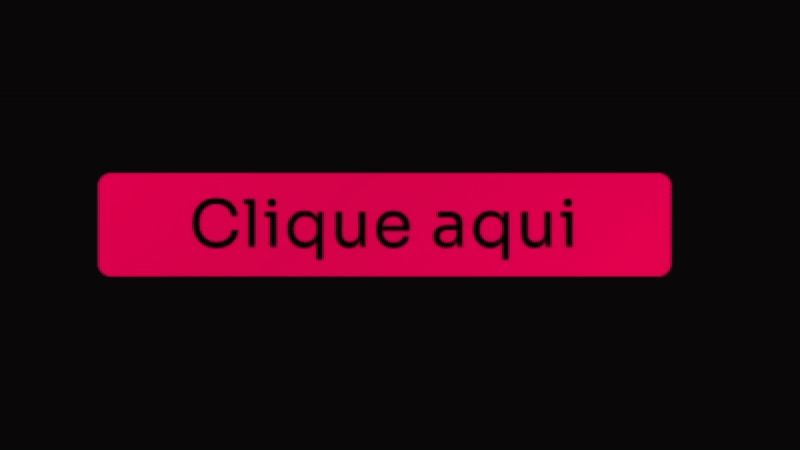
[Botão] Brilho + Preenchimento Adicione um Widget de botão no Elementor Defina a classe: btn Cole esse código no botão (Avançado/Custom CSS) Código CSS Copiar Código .btn{ /* Classe principal */ overflow: hidden !important; /* Esconde elementos que transbordam */ border-radius: 10px; /* Cantos arredondados */ } .btn .elementor-button{ /* Gradiente de fundo animado: tons de rosa vibrante */ background: linear-gradient(-45deg, #FF0255, #D4004B, #FF0255, #D4004B, #FF0255, #D4004B); background-size: 800% 400%; /* Tamanho do fundo para animação */ transition: all .5s; animation: gradient 5s infinite cubic-bezier(.62, .28, .23, .99) both; /* Animação suave */ } @keyframes gradient { 0%, 100% { background-position: 0% 50%; /* Posição inicial do gradiente */ } 50% { background-position: 100% 50%; /* Posição final do gradiente */ } } .btn .elementor-button-text{ align-self: center; padding-right: 0px; z-index: 9; /* Acima dos pseudo-elementos */ transition: 1s ease; } .btn:hover .elementor-button-text{ color: #090909; /* Cor do texto no hover (preto escuro) */ transition: 1s ease; } .btn .elementor-button::before{ content: “”; background: #FFFFFF; /* Cor de preenchimento no hover AGORA BRANCA */ width: 100%; height: 100%; position: absolute; top: 0; left: 0; border-radius: 10px; transform: scalex(0); /* Começa invisível */ transform-origin: left; transition: 0.5s ease; } .btn:hover .elementor-button::before{ transform: scalex(1); /* Preenche no hover */ transform-origin: left; transition: 1s ease; } .btn .elementor-button::after { content: ”; /* Gradiente de brilho (slide 100% branco) */ background: linear-gradient(10deg, #FFFFFF 100%, #FFFFFF 100%); mix-blend-mode: overlay; /* Mistura o brilho com o fundo */ width: 90px; height: 160%; position: absolute; transform: translateX(-50%) skew(-25deg); bottom: 0%; user-select: none; pointer-events: none; animation: shinery 6s infinite ease-in-out; /* Animação de brilho deslizante */ } @keyframes shinery{ 0%, 100% { left: -10%; opacity: 0; } 20% { opacity: 1; } 48% { left: 140%; opacity: 1; } 51% { opacity: 0; } }
[Soluções] Tamanho ícone em botões
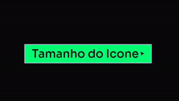
[Soluções] Tamanho ícone em botões Adicione um Widget de botão no Elementor Não precisa definir classe Defina um ícone (como nesse exemplo usei uma arrow right) Cole esse código no botão (Avançado/Custom CSS) Código CSS Copiar Código selector .elementor-button-icon { font-size: 55px; /* aumente por aqui o tamanho do ícone */ color: inherit; } selector .elementor-button-text { margin: auto; } Como descrito no código, você poderá alterar o valor ali (55px) para o tamanho que quiser do Ícone.
[Botão] Futurista Matrix
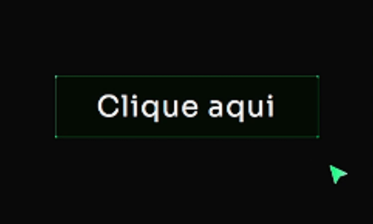
[Botão] Futurista Matrix Adicione um Widget de botão no Elementor Defina a classe: btn Cole esse código no botão (Avançado/Custom CSS) Código CSS Copiar Código .btn{ width: fit-content; position: relative; /* ancora os pseudos ::before/::after */ background: linear-gradient(0deg, #00FF73 0%, #68FFAC 100%); /* cor do BG aqui */ } .btn:hover{ background: transparent; box-shadow: none; } .btn::before, .btn::after{ content: ”; position: absolute; top: 0; right: 0; height: 2px; width: 0; background: #00FF73; /* cor principal da borda no hover */ box-shadow: -1px -1px 5px 0px #68FFAC, /* brilho verde claro */ 7px 7px 20px 0px #00C8FF, /* toque ciano p/ contraste */ 4px 4px 5px 0px #00FF73; /* verde principal */ transition: 400ms ease all; } .btn::after{ right: inherit; top: inherit; left: 0; bottom: 0; } .btn:hover::before, .btn:hover::after{ width: 100%; transition: 800ms ease all; }
[Botão] + Animação de Ícone
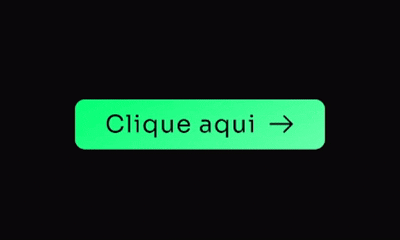
[Botão] + Animação de Ícone Adicione um Widget de botão no Elementor Não precisa definir classe Defina um ícone (como nesse exemplo usei uma arrow right) Cole esse código no botão (Avançado/Custom CSS) Código CSS Copiar Código .elementor-button{ background-image: linear-gradient(150deg, #00FF73, #68FFAC); /* Gradiente de fundo (verde) */ border: 2px solid #00FF73; /* Borda (verde) */ border-radius: 6px; /* Arredondamento */ box-shadow: 0 10px 40px -16px #00FF7380; /* Sombra verde (hex com alfa) */ transition: .5s all; /* Transição suave */ } .elementor-button:hover{ transform: translate(0, -3px); /* movimento sutil */ } .elementor-button:hover .elementor-button-icon{ animation: moveIcon 1.5s linear infinite; /* anima ícone no hover */ } .elementor-button-icon{ margin-top: 0px; /* alinhar ícone ao centro */ } @keyframes moveIcon{ 0% { transform: translateX(0); } 50% { transform: translateX(8px); } 100% { transform: translateX(0); } }